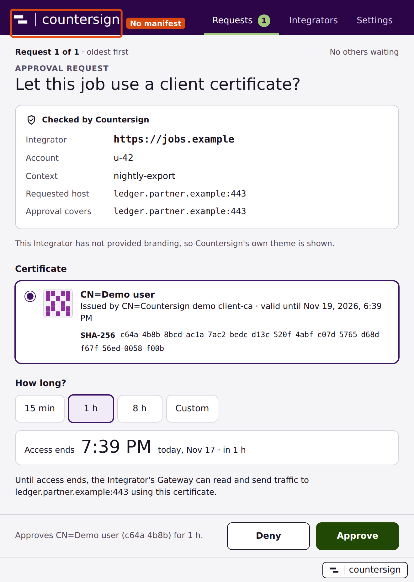
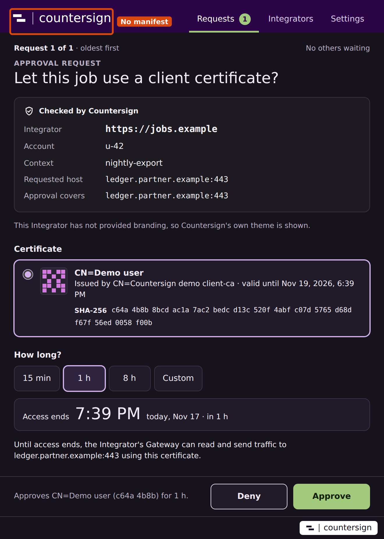
Web widget and Companion branding
The @zeroae/countersign-widget package registers <countersign-widget>. Once the first release is on npm, install it with npm install @zeroae/countersign-widget and bundle it into the authenticated page for a Context. From the source workspace, depend on "@zeroae/countersign-widget": "workspace:*". For a standalone site, the demo shows how to serve the three ES modules from your own origin. Widget implementation · Demo page
Connect the adapter
<countersign-widget></countersign-widget>
<p id="pair-instructions" role="status"></p>
The following page module uses the example Integrator's session contract. /api/session returns the signed-in user's CSRF token and optional public VAPID key. The /api/* routes belong to your application. Their handlers check the session, Origin, CSRF token and Context before calling the Broker API.
import { subscribeForPush } from "@zeroae/countersign-widget";

const widget = document.querySelector("countersign-widget");
const response = await fetch("/api/session", { credentials: "same-origin" });
if (!response.ok) throw new Error("Sign in to this Context first.");
const session = await response.json();

async function post(action, body = {}) {
  const res = await fetch("/api/" + action, {
    method: "POST",
    credentials: "same-origin",
    headers: {
      "Content-Type": "application/json",
      "X-CSRF-Token": session.csrf
    },
    body: JSON.stringify(body)
  });
  if (!res.ok) throw new Error("Request failed (" + res.status + ")");
  return res.status === 204 ? null : res.json();
}

const adapter = {
  pair() {
    document.querySelector("#pair-instructions").textContent =
      "Open Countersign, choose Pair, and enter " + location.origin;
  },
  async connect() {
    const { id } = await post("connect");
    return id;
  }
};

if (session.vapid && "serviceWorker" in navigator && "PushManager" in window) {
  adapter.subscribe = async () => {
    if (await Notification.requestPermission() !== "granted") {
      throw new Error("Notification permission was declined.");
    }
    await navigator.serviceWorker.register("/sw.js", { type: "module" });
    await subscribeForPush(await navigator.serviceWorker.ready, session.vapid,
      subscription => post("subscribe", { subscription }));
  };
}
widget.adapter = adapter;
| Member | Contract |
|---|---|
adapter.pair() |
Required. Guides the user into pairing. The Companion starts enrollment and opens the authenticated browser confirmation page. |
adapter.connect() |
Required. Resolves to the ID string of the account's request. The widget then exposes an Open Companion link for a user gesture. |
adapter.subscribe() |
Optional. Its presence displays Enable notifications. Resolve after the backend has saved the subscription. |
widget.showRequest(id) |
Displays a launch link for an ID your backend has checked for the signed-in user. Accepted syntax is 22–128 ASCII letters, digits, underscores or hyphens. |
widget.adapter = null |
Clears the old launch link and disables the controls. Set this on logout or while switching Contexts. Replacing the adapter also discards late UI results from its predecessor. |
The launch URL is countersign://approve/<id>. The Companion matches the hint against its authenticated inboxes and fetches the offer on the matching pairing. A cold start can take time to reconnect. If the browser declines the custom URL, open the installed Companion and review its pending requests. Desktop behavior
Web Push
To enable the fallback, configure the Broker's web_push section with its private VAPID key, contact and allowed push-service hosts. Pass the matching public VAPID key to the page. The Broker can send an encrypted JSON string containing an approval ID when the account has a pending initial or retry request and no connected Companion. Surface the ID returned by renew through the widget for pending replacements. Broker configuration
Bundle this worker module as /sw.js. Its click handler opens a fixed HTTPS page on the Integrator origin with the ID in its fragment.
import { installPushHandlers } from "@zeroae/countersign-widget/service-worker";
installPushHandlers(self, "/");
On that page, after sign-in and adapter setup, retrieve the current request before offering the launch link.
const id = new URLSearchParams(location.hash.slice(1)).get("countersign");
if (id) {
  const status = await post("status", { id });
  if (status.state === "pending" && status.id === id) widget.showRequest(id);
}
On logout, remove the subscription through the authenticated backend while the account session is still active, then call the browser subscription's unsubscribe(). The demo performs both steps. Notification handler · Demo logout handler
Style the web controls
By default the widget draws a Countersign card: a purple band with the Countersign mark, a headline, the buttons and a status line. The emphasized button is Pair Companion until you add the paired attribute, then Request access, with pairing offered as a Pair another computer link. The stylesheet is a constructed stylesheet in the shadow root, so it also applies under a strict style-src Content Security Policy. Its colours follow the page's color-scheme: a page that declares color-scheme: light dark gets the dark palette in dark mode, and a page that declares nothing stays light.
<countersign-widget paired>
  <span slot="headline">Ready to request access</span>
</countersign-widget>
| Hook | Use |
|---|---|
paired attribute |
Set it when the signed-in account already has a paired Companion. It moves the primary emphasis to Request access and turns Pair Companion into a secondary Pair another computer link, since the same account can pair more than one computer. |
headline slot |
Replaces the default headline, “Approve with your desktop”. Use it for state only your page knows, such as pending or ended access. |
--countersign-font |
Font family for the whole card. |
--countersign-accent |
Colour of the Open Companion link and focus rings. |
--countersign-band, --countersign-band-ink |
Header band background and its mark and wordmark. |
--countersign-surface, --countersign-line, --countersign-ink, --countersign-muted |
Card background, borders, text and status text. |
--countersign-primary, --countersign-primary-ink |
Background and text of the emphasized button. |
Shadow parts let page styles replace any rule. card, header, mark, wordmark, body, headline, actions, status and launch (the Open Companion link) name the regions. Every button has the part button plus pair, connect or push. The emphasized one also has primary, and the Pair another computer link of a paired widget has link.
countersign-widget {
  --countersign-font: system-ui, sans-serif;
  --countersign-accent: #235a44;
}
countersign-widget::part(card) { border-radius: 0; }
countersign-widget::part(button) { border-radius: 999px; }
countersign-widget::part(primary) { background: #235a44; border-color: #235a44; }
countersign-widget::part(status) { margin-block: .5rem; }
Keep the controls recognisable as Countersign's. Page explanations, such as whether the Companion is offline or why access ended, belong outside the widget. The demo page shows one way to lay them out beside it. Demo page
Brand the Companion prompt
Serve a UTF-8 JSON manifest at https://<integrator-origin>/.well-known/countersign.json. The Companion fetches it without cookies. If you include a logo, make its URL accessible on that same HTTPS origin without redirects.
{
  "version": 1,
  "displayName": "Finance workspace",
  "copy": "Quarterly reconciliation",
  "logo": "/assets/finance.png",
  "colors": {
    "accent": "#235a44",
    "background": "#f3f8f5",
    "dark": { "accent": "#7fcfa8", "background": "#0f1c16" }
  }
}
| Field | Accepted value |
|---|---|
version, displayName |
Version 1 and display name up to 80 UTF-16 code units. |
copy |
Optional text up to 240 UTF-16 code units. Text fields reject control and format characters. |
colors.accent, colors.background |
Optional six-digit hex colors. Defaults are #164e63 and #ffffff. |
colors.dark |
Optional object with both accent and background as six-digit hex colors, used when the desktop is in dark mode. Without it the Companion derives dark colors from the light pair. |
logo |
Optional relative or absolute same-origin PNG URL up to 1,024 UTF-16 code units. The download limit is 128 KiB and each dimension is at most 512 pixels. |
The manifest holds only these fields: hex colors and a PNG logo, with no CSS, fonts, SVG or HTML. It has an 8 KiB limit. The Companion stores accepted branding with its pairing. A change to any field, including colors.dark or the logo image at the same URL, is presented to the user for review on the Integrator's details page. The user can accept it or keep the current branding. On first pairing, an unavailable or invalid manifest leaves the Companion in its own theme, with the verified origin visible. Theme validation
How the Companion uses your branding
While one of your requests, your pairing confirmation or your details page is on screen, the whole Companion window takes on your colors: the header band, window background, surfaces, borders, tabs, links, focus ring and the Approve fill. The header shows your logo, display name and copy. Lists, settings and Integrators without a manifest use Countersign's purple theme.
The Companion treats your two colors as a starting point. It derives the full palette in OKLCH, keeping your hue, and then adjusts lightness until every text and control pair meets WCAG AA contrast in both light and dark mode. A very light accent therefore becomes a darker header band and Approve fill, and a dark background stays dark only in dark mode. Palette derivation
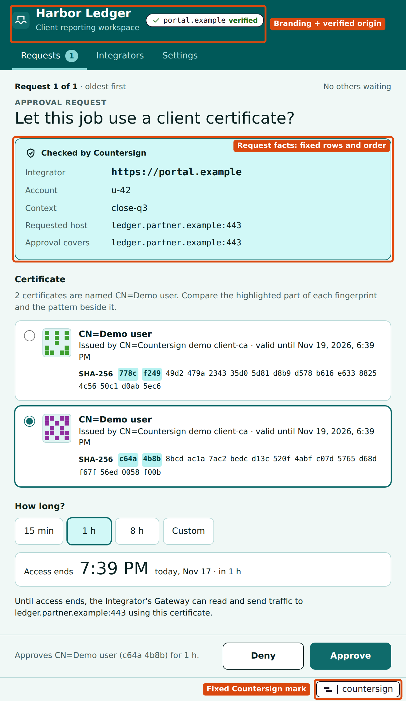
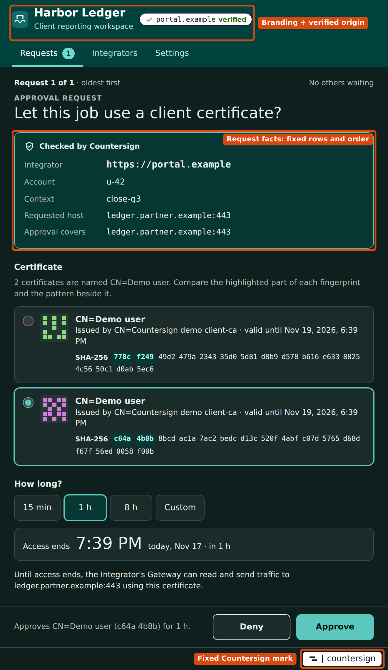
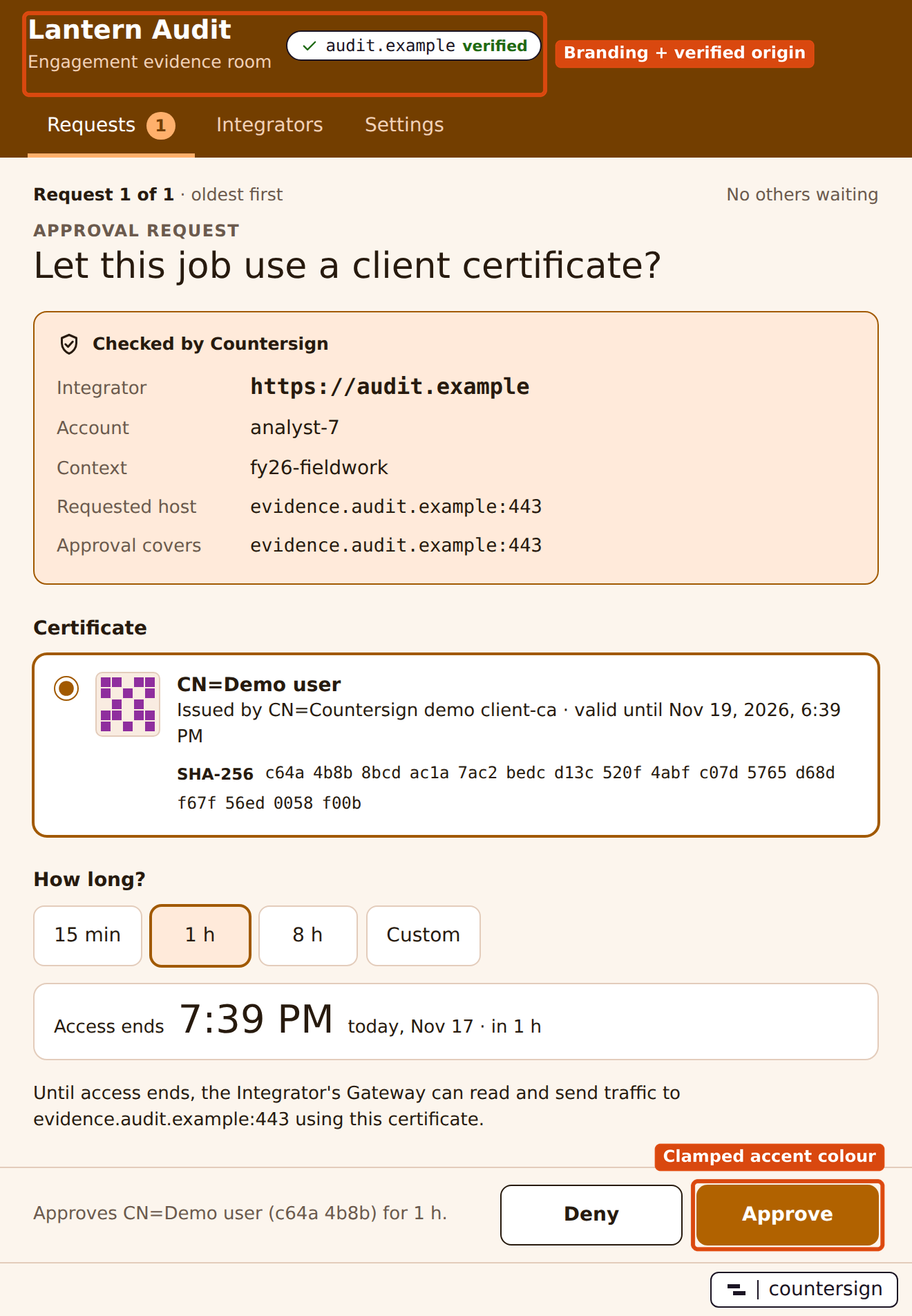
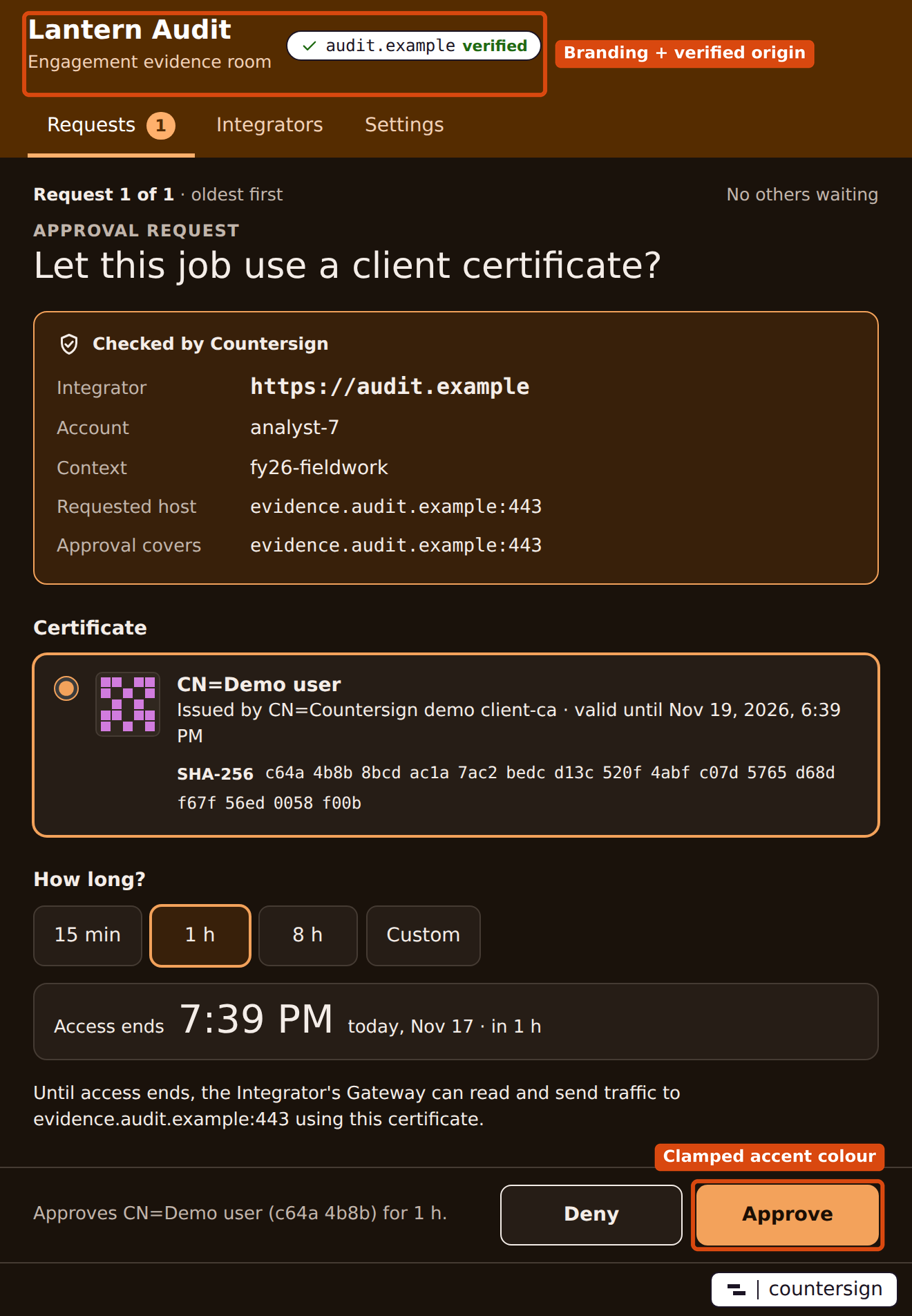
What stays the same in every theme
No manifest value can change the labels, order or visibility of these parts, or recolor them:
- The countersign mark at the bottom right of the window, on a fixed plate.
- The verified origin, always next to your display name, for example "Harbor Ledger · portal.example ✓ verified". The name never appears alone.
- The request facts: account, Context, requested host and approval scope, always present in the same order and wording, in clamped colors only.
- Warnings and errors, such as a wildcard scope, an unavailable certificate provider, a certificate that ends access early, or no eligible certificate. They use a fixed component with an icon and fixed colors.
- Deny and Approve, with fixed labels, Deny first, equal size, and Deny outlined.
- Certificate details at full contrast: fingerprint, issuer, Access ends and the sentence saying the Gateway can read and send traffic until access ends.
- When the queue moves to a request from a different Integrator, a fixed Now showing a request from banner, with Approve disabled for about a second and the reason shown.
Your logo appears only in the header, never beside the decision controls. Branding never reaches desktop notifications, which carry only a generic message.